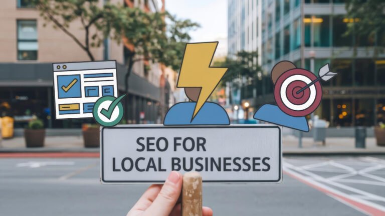
Why Website Buttons Matter for Conversions
Website Buttons for Conversions Kenya
Website buttons for conversions Kenya businesses rely on play a critical role in guiding users toward action. Buttons are not just design elements. They are decision points. Every click represents intent, and poorly designed buttons can quietly kill conversions.
Buttons tell users exactly what to do next.
Buttons Guide User Behavior
Visitors do not guess what to do. They follow visual cues. Buttons help users:
- Take the next step
- Navigate your site
- Complete actions
- Convert into leads or customers
Without clear buttons, users hesitate.
Buttons Act as Calls to Action
Buttons are your most direct calls to action. Common examples include:
- Get a Quote
- Contact Us
- Book a Consultation
- Buy Now
- Request Service
Clear actions increase conversion rates.
Button Design Influences Clicks
Design directly affects behavior. High converting buttons use:
- Strong contrast colors
- Clear readable text
- Adequate spacing
- Consistent styling
Buttons must stand out without looking aggressive.
Button Placement Matters
Where you place buttons determines whether users click them. Effective placement includes:
- Above the fold
- After key content sections
- Near testimonials
- At decision points
Strategic placement improves engagement.
Button Text Must Be Action Focused
Button labels should communicate value. Compare:
- Submit vs Get Your Free Quote
- Click Here vs Start Your Project
Value driven text performs better.
Buttons Improve Website Navigation
Buttons help users move between:
- Services pages
- Portfolio pages
- Contact forms
- Booking systems
Good navigation reduces friction.
Buttons Reduce Decision Fatigue
Clear buttons simplify choices. When users see one primary action, they feel confident acting.
Less confusion equals more conversions.
Buttons Must Be Mobile Friendly
Most Kenyan users browse on smartphones. Buttons should be:
- Large enough to tap
- Well spaced
- Easy to see
Mobile usability directly affects conversions.
Consistent Button Styling Builds Trust
Using different button styles across pages creates confusion. Consistency improves:
- Brand recognition
- User confidence
- Predictability
Users trust familiar patterns.
Button Color Psychology
Color affects emotion. Examples:
- Green for action and confirmation
- Blue for trust
- Orange for urgency
Choose colors that align with your brand and CTA purpose.
Avoid Too Many Buttons
Too many CTAs overwhelm users. Focus on:
- One primary action
- One secondary action
Clarity improves decision making.
Test Button Performance
A B testing helps determine:
- Best colors
- Best wording
- Best placement
Data driven decisions increase results.
Buttons Support Conversion Funnels
Buttons connect each stage of the funnel from awareness to action. Weak buttons break the journey.
Common Button Mistakes
Avoid:
- Low contrast colors
- Generic text
- Hidden placement
- Too many CTAs
- Inconsistent styles
Fixing these improves performance.
How Africa Web Experts Designs High Converting Buttons
At Africa Web Experts, we design buttons that are visually clear, strategically placed and conversion focused. Explore user focused website designs on our Portfolio page and review conversion optimisation services on the Services page. For CTA optimisation, reach out via the Contact page.
Frequently Asked Questions
Why are buttons important for conversions?
They guide users toward action.
What is the best CTA button text?
Text that communicates value and action.
Do button colors matter?
Yes. Color contrast improves visibility.
Should buttons be the same across pages?
Yes. Consistency improves trust.
Can Africa Web Experts optimise my website buttons?
Yes. We improve CTA design and placement.
Final Call to Action
Website buttons play a powerful role in driving conversions. If you want buttons that guide users clearly and increase clicks, Africa Web Experts is ready to help.
Reach out today and optimise your website for action.